IHG was migrating all hotel websites to a new content platform. This upgrade would bring significant improvements to the web experience and set the stage for continuous enhancements.
For the first time, Crowne Plaza hotels would be able to showcase their unique offers on their websites.
Objective
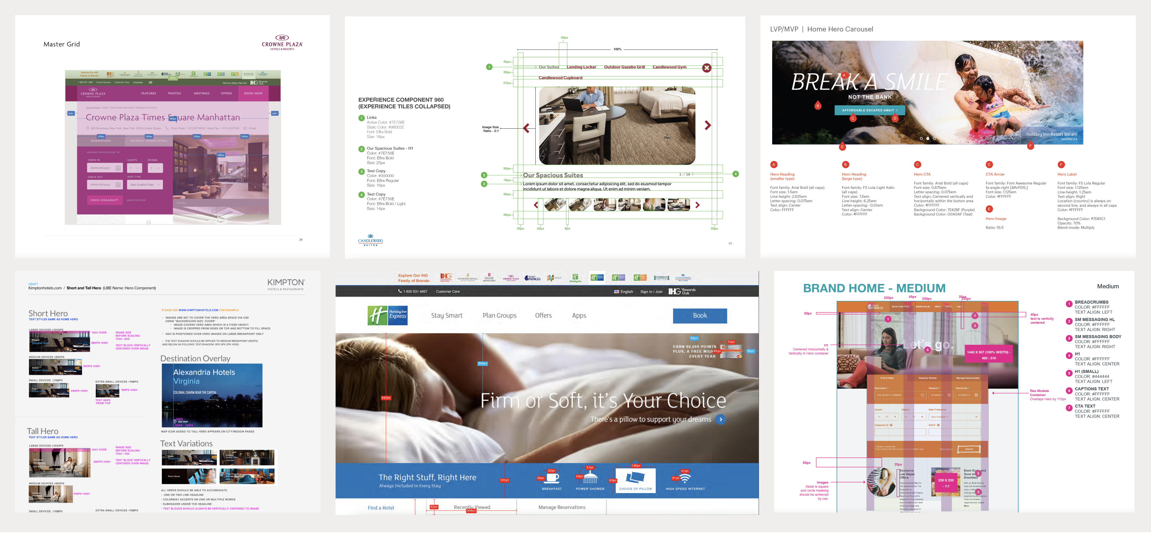
Utilizing the newly created global component design system, we aimed to redesign Crowne Plaza hotel websites to better meet the needs of customers and hotels.
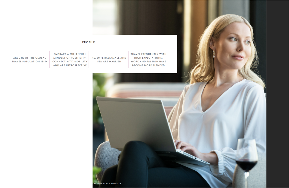
Target audience: the Modern Business Traveller
CP has historically targeted business travelers, and had updated the persona: while productivity matters, they also seek inspiration, energizing experiences, and moments of downtime.
Scope and constraints
- New page templates for homepage + 5 subpages
- Existing page template for 4 subpages
- Existing components, with Premium styles and updated CP branding
- Utilize existing hotel-provide content
- Ensure Digital Accessibility compliance (WCAG AA standards)
As design lead, my responsibilities included:
- Providing design concepts and detailed design
- Overseeing agency designers
- Collaborating with content strategy, product and engineering
- Managing design timelines and deliverables
- Presenting to senior leadership and UK brand team
Design process
Establishing a baseline
We conducted a usability test of the current homepage to better understand our customers’ needs.


Cleaner design, larger photos, more relevant content
We then iterated on the page design, applying the updated brand guidelines to our new global component system.
Header and intro
With the elevated brand identity, we explored ways to most effectively utilize the brand’s primary plum color.
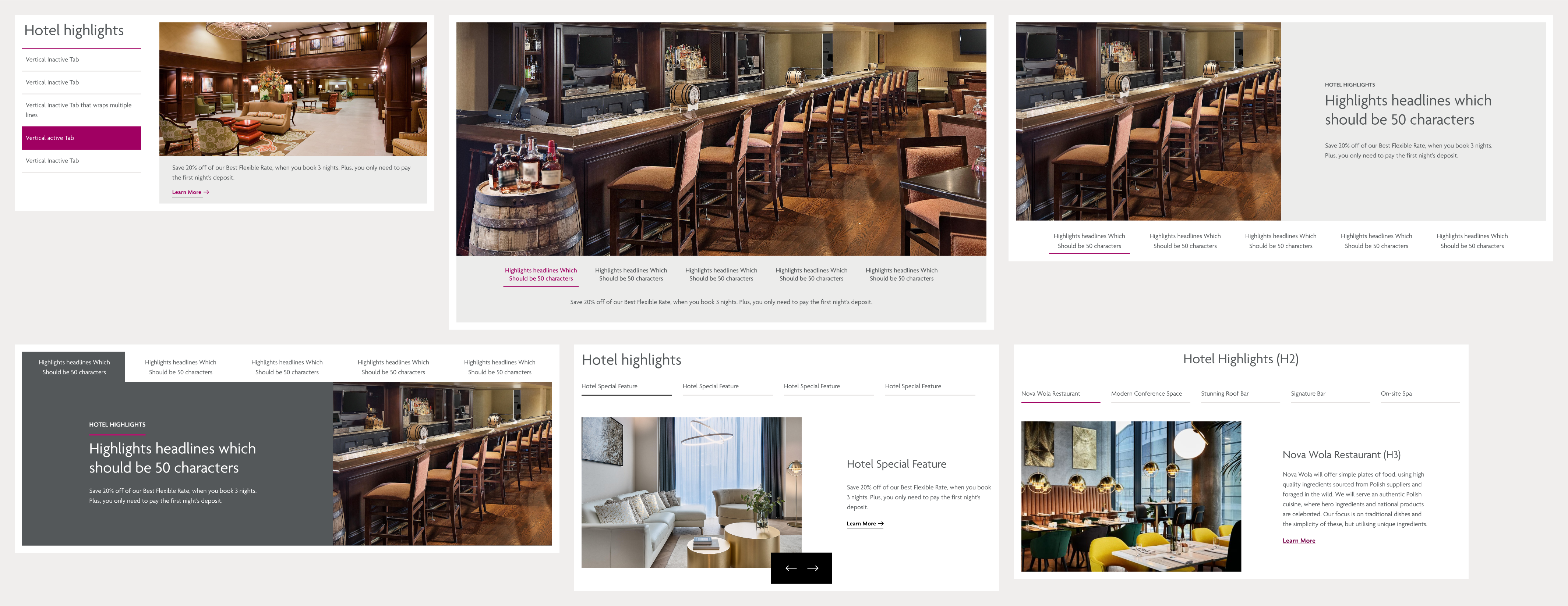
Hotel highlights
Within the Highlights component, we had some flexibility on top/bottom and left/right designs.
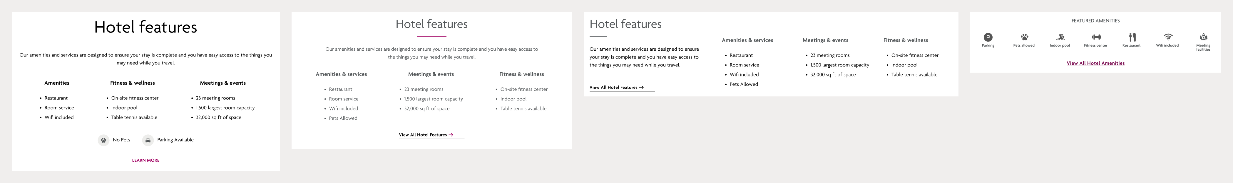
Hotel features
Our goal was to communicate key features at a glance, so I designed the amenities section, displaying global icons used in the booking flow.
International considerations
Crowne Plaza is a global brand, so all designs must accommodate translations in 15 languages, including right-left Arabic designs.

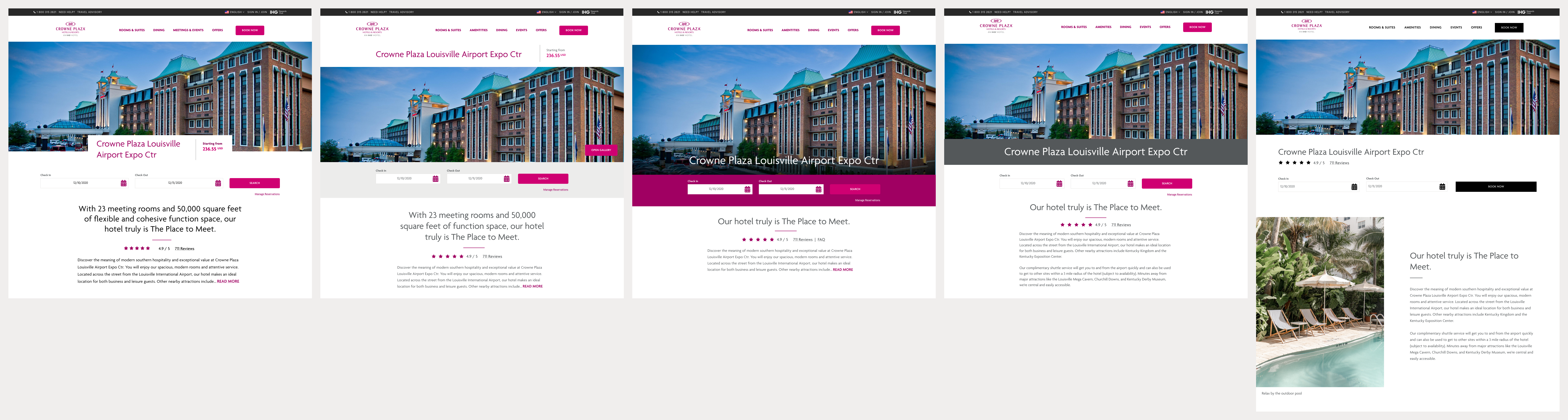
The final design
Upon stakeholder approval, we tested our homepage design with 15 users to ensure the design and content hierarchy met their expectations and needs. The only change needed was decreasing white space between sections, reducing scrolling.
High level benefits
- Modern design that aligns with the Crowne Plaza identity of today
- Research-based content strategy and layout that brings:
- Improved SEO equity
- Additional content for our customers
- More robust navigation and deeper site structure
- Ability for field marketing to create hotel-specific content without development
- Improved accessibility
Homepage
Multi-page hotel website that more clearly highlights the benefits of each property

Hero carousel features large-scale, high-impact photography
Easily scannable using icons to highlight amenities and services
Location info at a glance
Room types overview with link to more detailed info
New hotel highlights design enables hotels to display custom content
New Offers design allowing customers to see more offers at once
New destination teaser to entice the Modern Business Traveller
Additional content and updates to FAQs to improve SEO for hotels
Subpages
Each additional page was designed to best feature Crowne Plaza’s offerings to the Modern Business Traveller and features a hotel-specific hero image with link to view more on the Photos page.

The Amenities page displays detailed hotel information, prioritized via research. Each section is quickly accessed via a jump nav in the top section. (We conducted usability tests to determine the most effective design for the jump nav.)
The Dining page features restaurant and bars, requiring a net-new component to display hours, location, and additional details.
The Meeting & Events page displays an overview for event planners, with a net-new Weddings feature that links to hotel-specific weddings landing pages.
Offers will be filtered to only show meetings & events. Machine learning can be used to target offers to guests based on known data.
Local area pages have been revamped to improve SEO equity.
The Photos page allows guests to dive deep into the hotel experience. Our research showed that after price, photography is the most important factor for travelers and plays a role of 60% in the decision to book.
“Wow… invititing and welcoming…comprehensive… engaging”
— usertesting.com test participants
To improve efficiency, IHG planned to rebuild all brand sites on a common platform, Adobe Experience Manager 6.5, within a year. With a common code base, global updates could be made by our content authors within days instead of months.
This was also a critical part of a larger marketing initiative, implementing Adobe Target to enable personalized content.
Converting 14 unique web sites to a singular platform
I led a team of designers, collaborating with our content strategist, product managers and developers throughout this effort.
Objective
To build a useful and usable set of Figma brand libraries for AEM 6.5 components (reference architecture) that will provide a single source of truth for all teams involved and allow IHG to create responsive web pages more consistently, faster, and at scale for all guests.
Target audience
- Designers
- Product teams
- Dev teams
- Content authors
Scope and constraints
- 14 brands
- 14 components
- 3 pages per brand: homepages, Offers and Offer Details
- Keep existing content
- Minimal design changes
Discovery, Design and Development
We started by gathering the 14 PSD, PDF, and online style libraries — a wide variety of documents from various sources. There were no common breakpoints, image ratios, font styles, or components.
We then reviewed the requirements for each of 14 out-of-the-box components and mapped to our existing designs. Developers and content authors walked us through their process so that we could annotate designs accordingly.

Starting with a wireframe component library, we then mapped out the possible pattern variations for each component. Collaborating with product and dev team to identify opportunities for customization, we built out the first 6 brand component libraries.
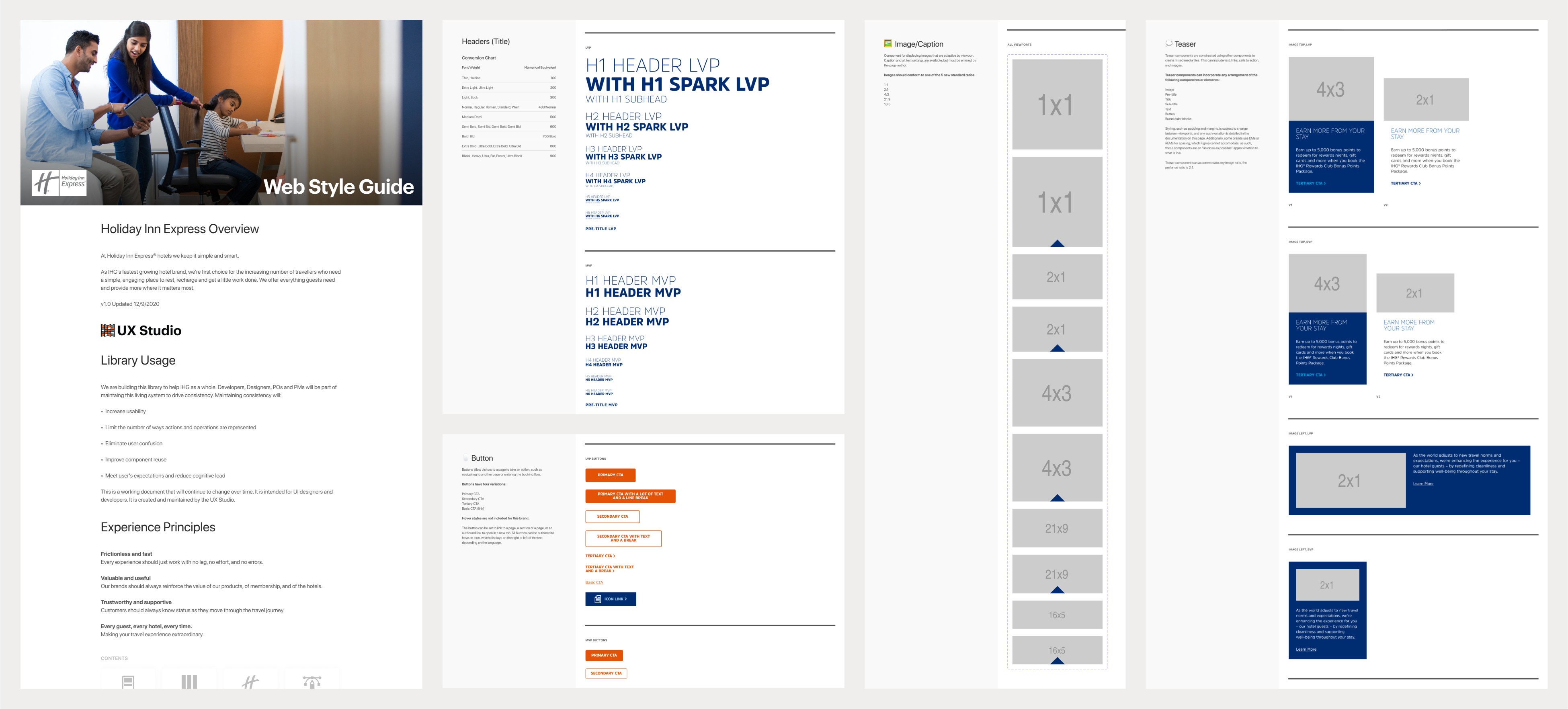
Throughout design, we met with with stakeholders, product and dev teams to refine components based on new requirements. We trained engineers and content authors to inspect Figma files for design specs, reducing the need for additional documentation.
“These Brand Style Libraries are a game changer!”
— Stephanie Wood, Product Architect Manager
In 2020, The COVID crisis led to a collapse in domestic and international travel. According to the World Tourism Organization, international tourist arrivals declined globally by 73 percent in 2020. Globally, airlines and hotels saw a 50%+ decline in revenue.
Our goal was to instill confidence, trust and ease throughout the dream, browse, and booking process, ultimately increasing conversion. With constrained budgets, we identified UI/UX optimizations utilizing existing content, and requiring minimum dev effort.
I led a team of information architects and designers, partnering with product managers and developers throughout this effort. I participated in workshops, analyzed data, led design strategy and deliverables.
Customer deep dive
To better understand our customers’ needs during this time, we observed 60 participants selecting and booking a hotel.
- unmoderated interviews
- frequent online hotel bookers
- mainstream and luxury guests
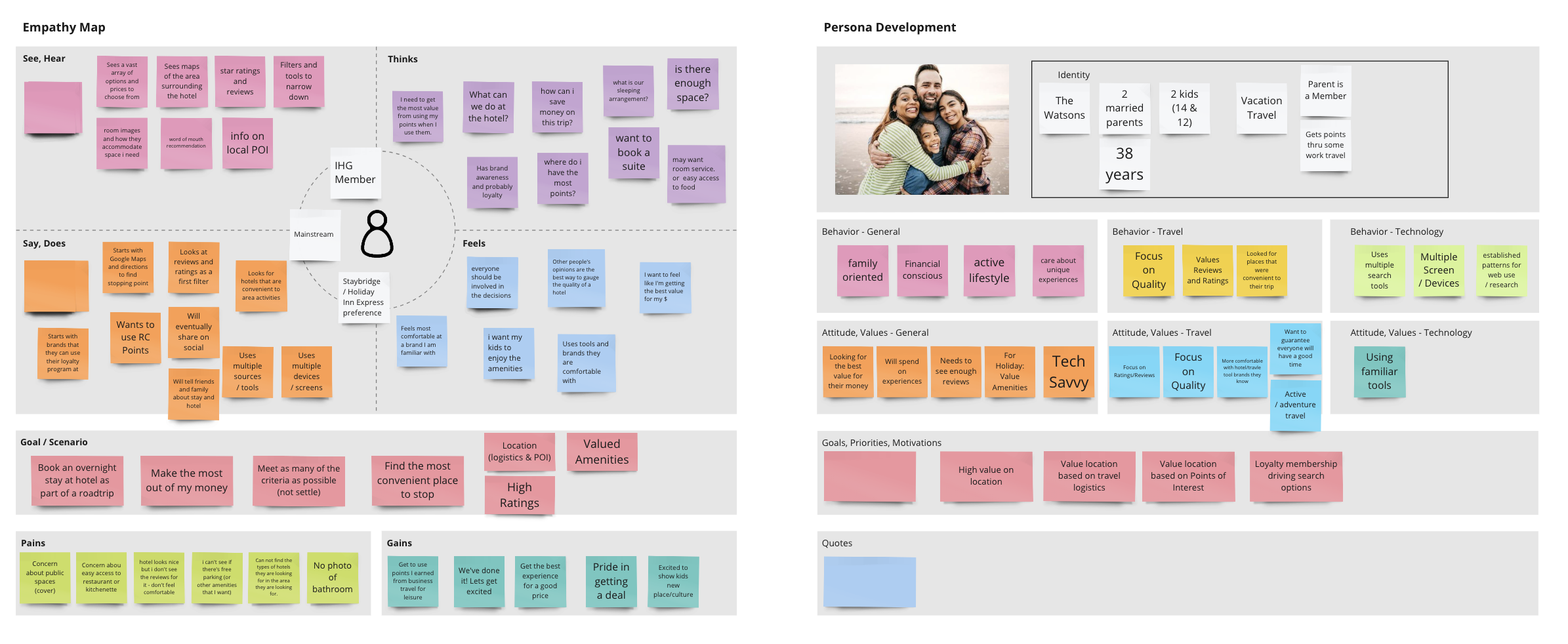
From our research, we mapped out the customer journey and brainstormed opportunities for where we can provide most value to our users based on their existing needs. We conducted a series of workshops to analyse our data and find patterns in the decision-making process through the lens of multiple personas.

Based on our research and Adobe analytics, we prioritized 4 bodies of work across the booking flow customer journey:
Filter & sort prominence: How might we clearly display filter & sort capabilities so users can easily narrow down their search options?
New filter & sort capabilities: How might we provide users with additional filter options so that they’re able to find their most preferred hotel?
Map prominence: How might we make the map more accessible so users can find hotels in their desired location?
Amenity list optimization: How might we showcase relevant and appealing hotel information so users can easily decide on a hotel?
Narrowing the focus
As a result of the initial round of user tests, we were able to narrow the focus of the original ToN project list to prioritize projects that best improve the users’ ability to select a hotel based on Location, Price, and Ratings.
We created designs and built prototypes that addressed the following:
- Location: Improved Map / List Toggle design
- Price: Separate Sort from the filter menu. (sort by Price: Low to High was the number one requested filter or sort menu option) Also, improved visual design of the tool menu.
- Ratings: Add Cleanliness Rating to the hotel Card
We asked 22 participants to select a hotel in 2 different scenarios, to better understand how and when they may or may not use the map, filter, and sort features. Two desktop and two mobile prototypes were used in the unmoderated tests.

Results
Those who used the tools found them easy to use.
While use of the tools was still unpredictable and dependent on the behavior patterns, habits, and/or needs of the user, the tests did show that both of our designs were:
- Easy to use
- Clearly indicated their function
- Readily visible
- On desktop, the more prominent Map button was easier to find, and led to increased usage of other tools
- Half of desktop users engaged, most mobile users did not
- Small percentage didn’t notice the button.
- Those that did use it found the button clear and the tool helpful.
- The majority of desktop users did sort; most mobile users did not
- Distance, Ratings and Price: Low to High were the primary selections.
- Most desktop and mobile users did not filter
- Requested: price and ratings range filters.
- Users talked to the importance of filters but didn’t actually use them.
- Users prioritize Ratings very highly. Often eliminating hotels by ratings score and number of ratings then referring to Location then Price.
- Users in this test would spend more money on a hotel with better ratings.
Fine-tuning hotel content
Having focused on the structure of the page, we then looked the hotel cards:
How might we showcase relevant and appealing hotel information so users can easily and quickly evaluate multiple hotels and easily find their best-fit hotel?
To learn more about what is important to our guests, we conducted a card-sort activity.
Participants were shown an image of our search results page with a list of empty hotel containers. They were then asked to show us what information they would like to see in the empty hotel containers by choosing from a list of hotel information provided to them.
Results
Overall, the most frequently selected information users want to see in the hotel container are:
- Hotel name
- General guest ratings
- Free wi-fi
- Free breakfast
- Address
- Free parking
- Distance from destination
- Short hotel description
Leisure guests care more about:
- Free parking
- Proximity to POIs
- Pet friendly
Business guests care more about:
- Restaurant onsite
- Free shuttle bus
Map, breakfast, and the 3 P’s
We already knew that price and location were primary drivers in hotel selection, and that “breakfast included” was key. However, we learned that conversion was higher with filter use, the most selected being pets allowed, parking and pool.
This updated Search Results page continues to perform well, 3 years later. What began as a focused optimization for a specific situation became a lasting success.
Increased revenue by $115M!
In order to optimize, modernize, and humanize the web booking experience, I lead the redesign of the entire flow, from hotel search to booking confirmation.


Select a Hotel
Objective
To drive conversion and reduce customer friction by providing key hotel information via a clean, scannable experience.
Process
-
Analyzed the existing page via an in-depth moderated usability test, A/B tests, FullStory and Google Analytics
-
Tested multiple versions of the hotel card, with varying amounts of content
Outcome
- Step conversion from this page has increased, with additional A/B testing in progress

Select a Room & Rate
Objective
To drive conversion and revenue by delivering Clarity of Choice thru Simplicity, Comparability and Compelling content. The existing experience spanned two separate pages, with a lot of content and too many room and rate options.
Our goal was to remove clutter, confusion and cognitive overload.
Process
- Through usability tests, we found that customers constantly flipped back and forth between the Rooms and Rates pages to determine the best value. So we combined the pages for easier comparison and worked with the revenue management team to limit the number of rates displayed
- From voice of customer, we knew that we displayed too many rates and that our rate names were confusing. So we highlighted each rate’s key differentiator — non-refundable, cancellable within 7 days, etc.
- We continue to iterate and optimize both viewports, responding to user data
Outcome
-
This new page was a huge win with an increase of 824K Bookings and $88M Revenue projected within the first year
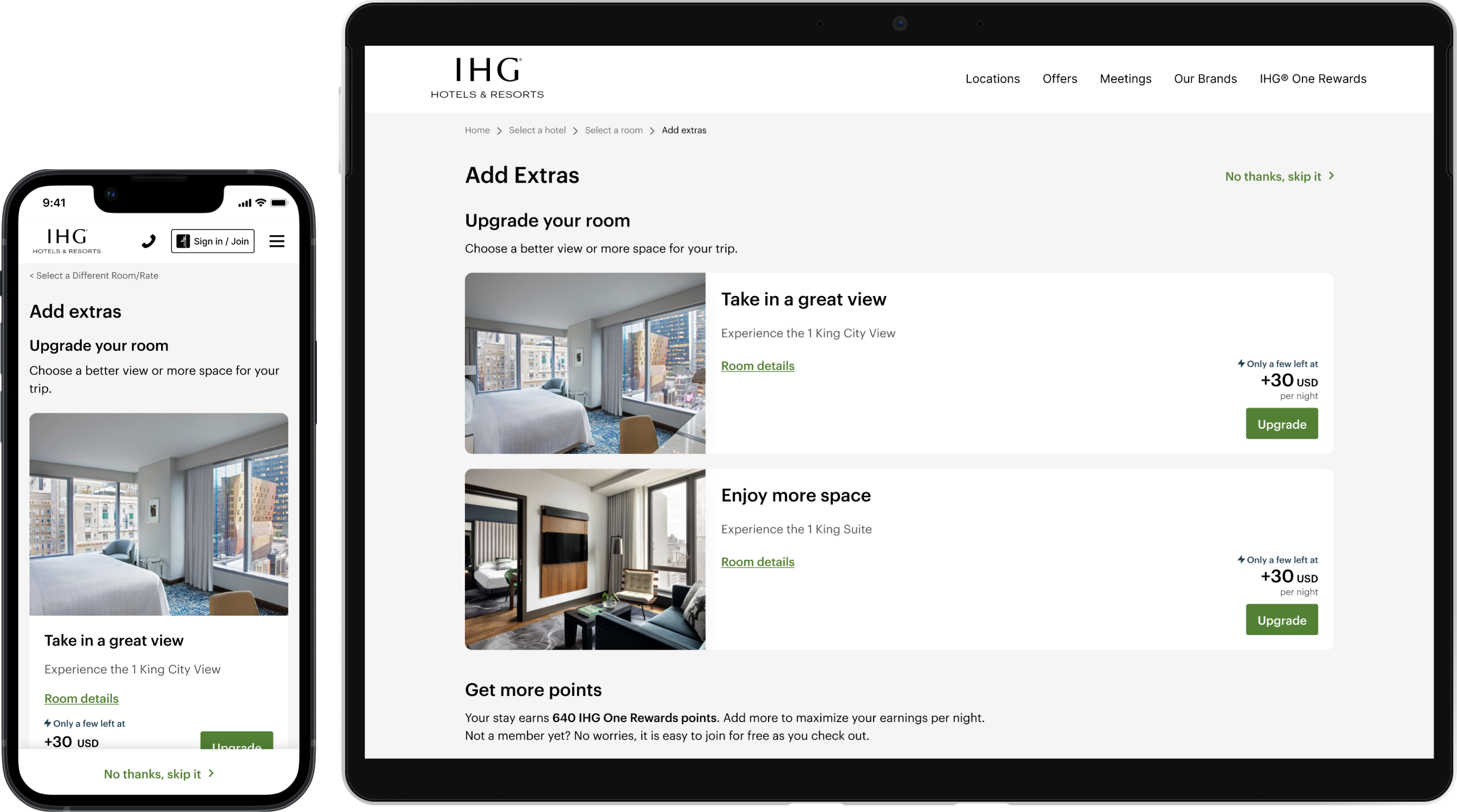
Add Extras
Objective
To increase AOR (Average Order Value) via room upgrades, Points packages, and non-room inventory add-ons (meals, parking, experiences).
Process
-
From previous research, we had learned that customers were most likely to upgrade to a better view, or more space, so prioritized those items
-
Through multiple A/B tests, we continue to iterate and optimize both viewports, responding to user data
Outcome
-
The full page is only rolled out to a percentage of properties, but initial results are positive
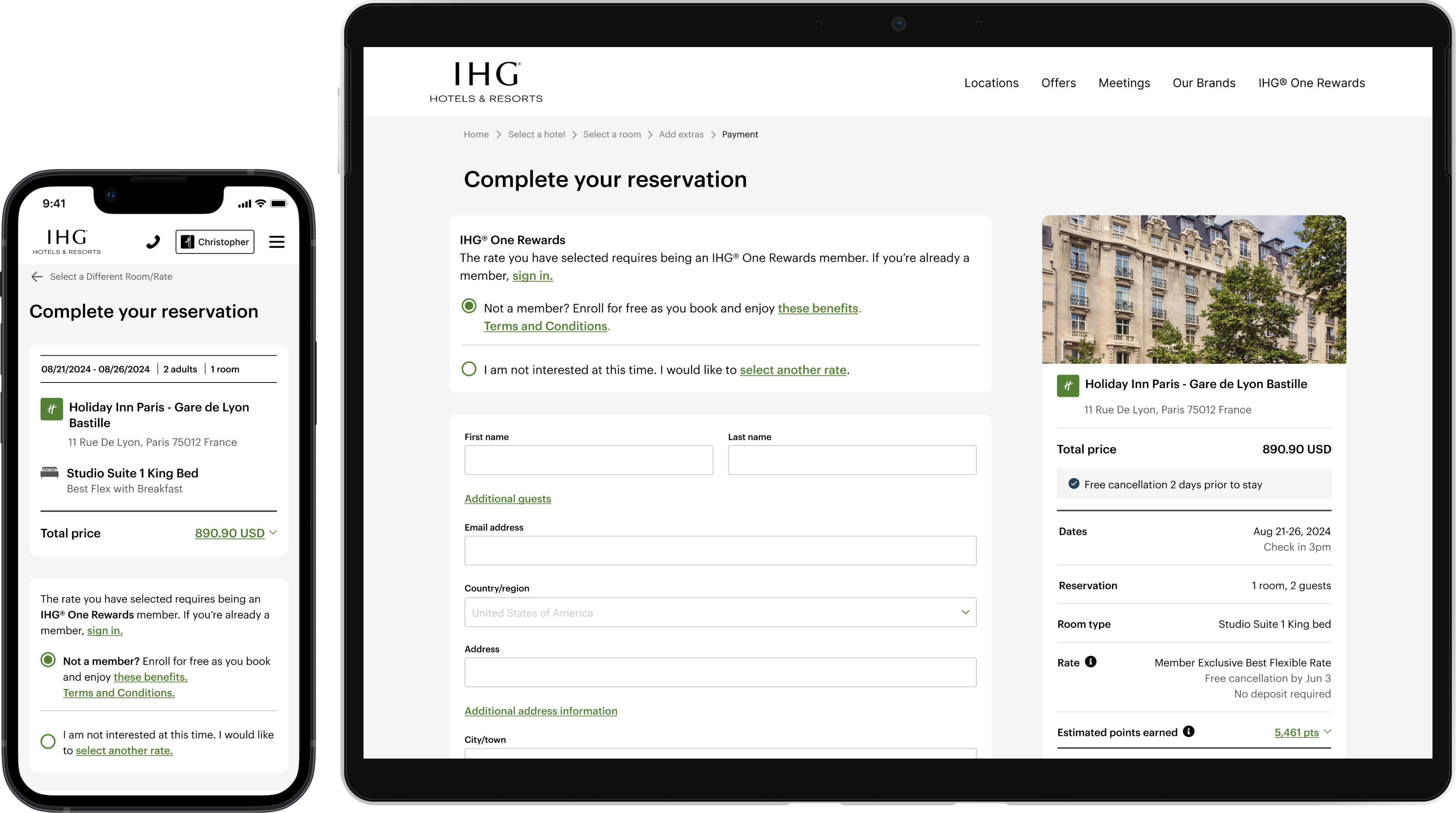
Complete your Reservation
Objective
To drive conversion and increase customer confidence by replaying detailed stay information and clearly defined steps to complete their transaction. Secondary objectives were to increase IHG One Rewards membership and Chase credit card enrollments.
Process
-
We started with a reskinned page and focused on key areas for optimization: Stay details content and placement, Total cost display, and IHG One Rewards Quick Enroll display
-
Through multiple A/B tests, we continue to iterate and optimize both viewports, responding to user data
Outcome
-
For the desktop view, projected increases of 73.6K Bookings and $26.5M Revenue within the year
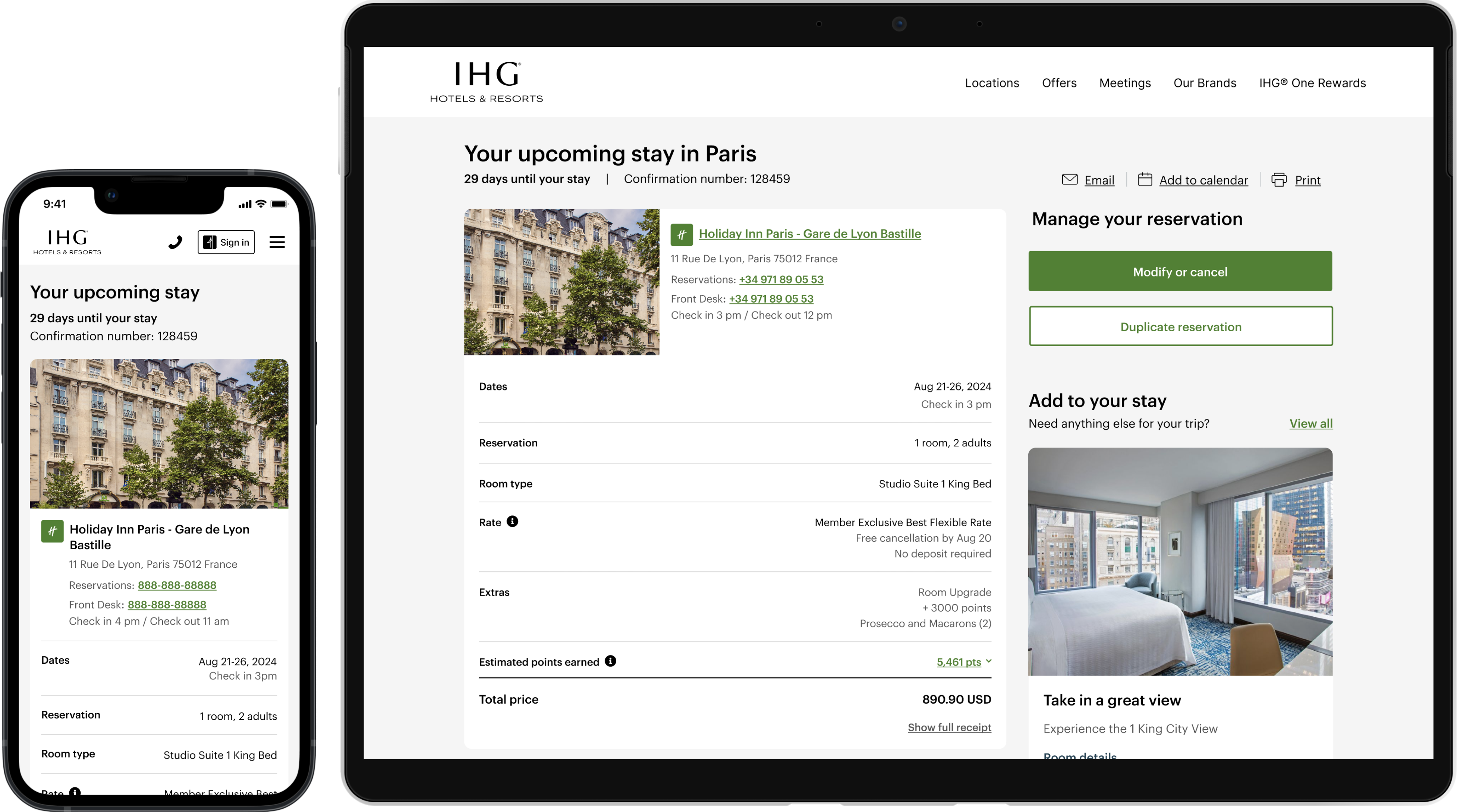
Reservation Confirmation
Objective
To increase customer confidence by replaying detailed pay and stay information. Secondary objective was to increase upsell and cross-sell engagement.
Process
-
We started with a reskinned page and focused on key areas for optimization: Stay details and Upsell/Cross-sell
-
Through multiple A/B tests, we continue to iterate and optimize both viewports, responding to user data
Outcome
-
Average Daily Rate (ADR) increased due to the addition of Upsells and Cross-sells.
DESIGN LANGUAGE SYSTEM
To ensure design consistency and increase speed to market, we’ve built and maintain an extensive component library in Figma, globally accessible via Zeroheight.
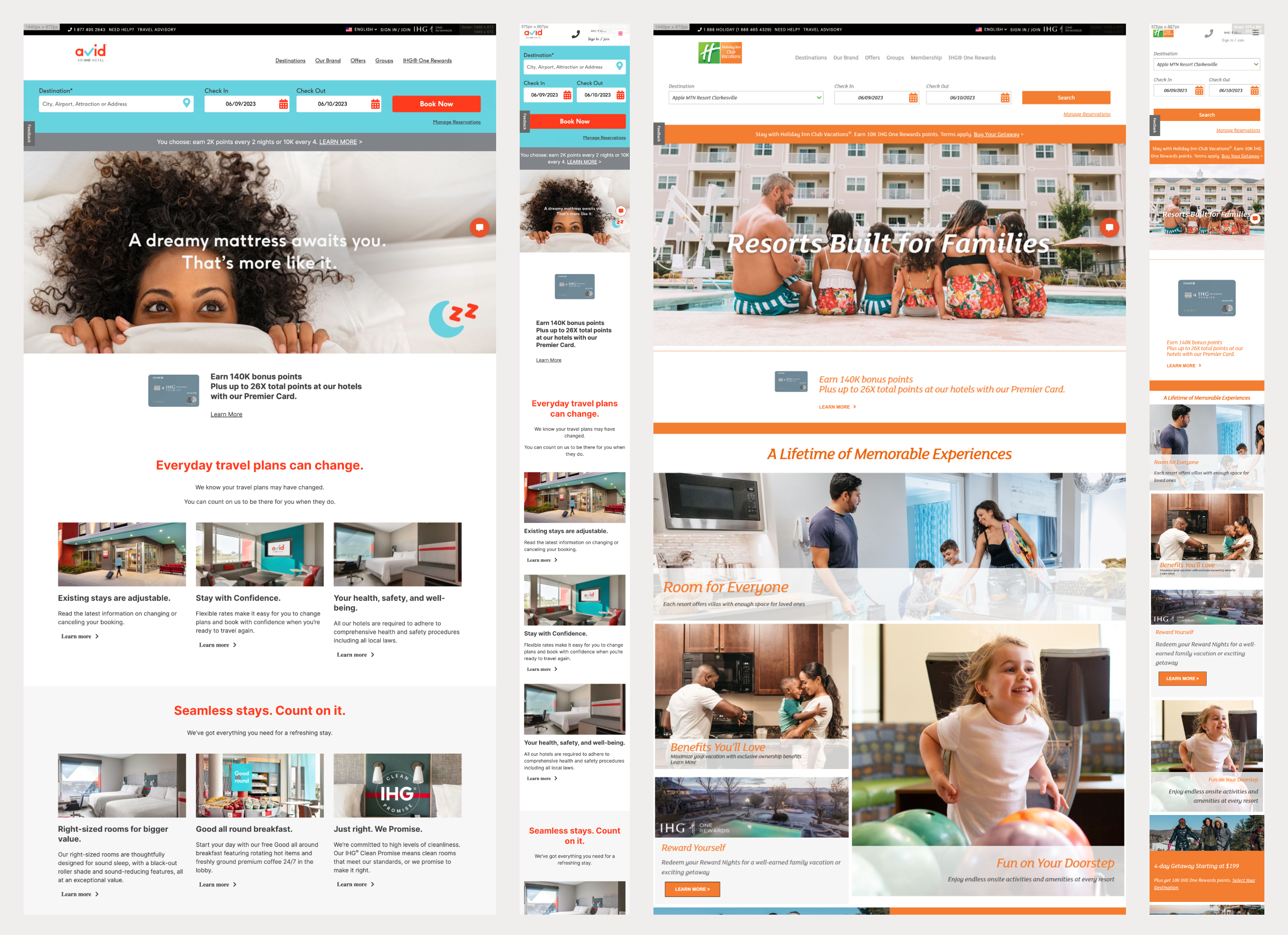
The Holiday Inn Express customer is looking for top-level content, at a glance: location, price, and top amenities. I lead the team in designing a clean, modern, frictionless experience.
Map
Pairing the image carousel with a simple map at the top of page met our customers’s top needs.
Hotel Highlights
To meet the needs of each hotel, we create the Hotel Highlights component, pulling images and content from our hotel content management system.
Amenities
Holiday Inn Express is valued for its consistency and quality. So, we pair brand highlights with hotel-specific amenities.
Mobile viewport
As many of our customers book a same-day stay while traveling, the mobile viewport is especially important.